 News News |
FAQ
|
| Search
|
Home
|
| Getting Started | Documentation | Glish | Learn More | Programming | Contact Us |
|
| Version 1.9 Build 1556 |
|


    fme := frame( )
    b1 := button(fme,'Button One')
    b2 := button(fme,'Button Two')
    whenever b1->press do
        print 'Button One Pressed'
    whenever b2->press do
        print 'Button Two Pressed'
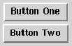
This example generates a simple dialog containing two buttons,
and when the user
presses either of the buttons, a message is printed by the whenever
statements. The dialog box which this creates looks like the one in
Figure 11.2.
It is simply a frame with two buttons. In addition to the parameters shown in
this example, buttons accept many other construction parameters. These are summarized
in Table 11.4.
In this example, if fme is constructed with side set to left, then the buttons are arranged horizontally instead of vertically. In fact, if the frame is sent side events:
    fme->side('left')         # arrange left to right
    fme->side('right')        # arrange right to left
    fme->side('bottom')       # arrange bottom to top
the buttons can be dynamically rearranged. In an analogous way, the text of
the buttons can also be changed:
    b1->text('First Button')
    b2->text('Second Button')
The other events which buttons accept are similar to the construction parameters;
they are outlined in Table 11.5. The only event which buttons
generate is the press event, and this is the hook through which buttons
cause actions in a script.
|
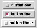
As shown in Table 11.4, there are several different types of buttons - plain, radio, check, and menu. These are set with the type parameter. The example above shows how plain buttons work. Below you will see how other buttons work.
    root := frame( side='left' )
    fbox := frame( root, borderwidth=0 )
    box := [=]
    for (i in "one two three")
        {
        box[i] := button(fbox,paste('button',i),type='check',value=i)
        whenever box[i]->press do
            print "check button", $value, "pressed"
        }
When the user clicks on check buttons, the appearance of the button
changes to indicate the state of the button. Note that the the value
parameter to button is used to permit later differientation of
the buttons. The graphic that this script creates is shown in
Figure 11.3. Note, however, that the second button has been
pressed by the user.
The script prints ``check button two pressed'' in response to the selection
of the second check button. This action is again accomplished with a
whenever statement. Each time one of the check buttons is pressed
a press event is generated.
You can query the state of a check button with the state event:
print box[2]->state()
Since the second button is selected once, the output of this
statement is T. The state event is also used to set the
state. So if you want to unselect the second check button, you do
something like:
box[2]->state(F)
and the the appearance of the second button's check box changes to look like
the checkboxes of the other two check buttons.
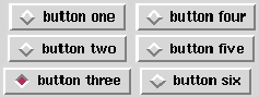
To change the dialog in Figure 11.3 to use radio buttons instead of check buttons, you can do the following:
    for (i in "one two three")
        {
        box[i] := button(fbox,paste('button',i),type='radio',value=i)
        whenever box[i]->press do
            print "check button", $value, "pressed"
        }
    box[i]->state(T)
Notice that you use the same toplevel frame from the example above, but
when each box[i] is reassigned, the previous widget is deleted.
Assume you wanted to have an extra column of radio buttons, you can do
it as follows:
    nf := frame(root, borderwidth=0)
    for (i in "four five six")
        {
        box[i] := button(nf,paste('button',i),type='radio',
                         value=i,group=fbox)
        whenever box[i]->press do
            print "check button", $value, "pressed"
        }
After running these two small scripts, the dialog Figure 11.3 will
change dynamically to look like Figure 11.4.
Here again, a press event is generated each time a user selects one of the
buttons, and the state of the buttons can be set and queried with the state
event. Now, however, selecting button five, for example, causes the previously
selected button, here button three, to be unselected. This is the behavior of
radio buttons. Specifying the group for the second column of radio buttons
make the two columns act as one group.
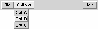
As before, a button is indicated to be a menu by setting the type parameter. Here is a simple example:
    top := frame()
    bar := frame(top,side='left',expand='x')
    file := button(bar,'File',type='menu')
    opt := button(bar,'Options',type='menu')
    rec := [=]
    rec['space'] := frame(bar,width=150,height=1)
    help := button(bar,'Help',type='menu')
    for (i in "A B C")
        {
        rec[i] := button(file,paste('File',i))
        rec[len(rec)+1] := button(opt,paste('Opt',i))
        rec[len(rec)+1] := button(help,paste('Help',i))
        }
In this example, there are a couple of things to note. First a frame, bar, is
created to contain all of the menus. This is how a menubar is created in Tk. Note
that the expand parameter is set to 'x' indicating that bar
will only expand horizontally. This is to prevent the frame containing the
menu buttons from expanding vertically if the user resizes the window. Next,
two menu buttons, file and opt, are placed in bar, and because
of the way bar is constructed, these menu buttons are organized left to
right. Next a frame is used to space the next menu button out to the end of the
dialog, and then another menu, help, is added to the menubar. The
loop simply fills each of the menu buttons with entries which are simply more
buttons. The key thing to notice is that the parent of these buttons is a
menu button.
Entries in a menu button are the only case in Glish/Tk where a widget can have a parent which is not a frame. Figure 11.5 shows what the menubar created above looks like when the user selects, i.e. presses, the ``Options'' menu button and selects the second menu element. The selection by the user of entries in a menu button are caught using whenever statements in the same way as regular buttons. For example:
    whenever rec['A']->press do
        print "Got It!"
causes ``Got It!'' to be printed by the interpreter whenever the first
entry in the file menu button is selected.