 News News |
FAQ
|
| Search
|
Home
|
| Getting Started | Documentation | Glish | Learn More | Programming | Contact Us |
|
| Version 1.9 Build 1556 |
|


    lbf := frame(f)
    lb := listbox(lbf)
    lb->insert("one two three four five six seven eight nine")
In this case, only the parent is specified to create the listbox.
Table 11.6 lists all of the options for creation of listboxes.
Creating a listbox, however, only generates an empty listbox with
no options for the user to choose. An insert event must be sent to the
listbox to place strings in the listbox. These strings represent
the choices which the listbox presents the user.
A listbox has a mode which specifies how the user can select items. By default, the listbox is in 'browse' mode. In this mode, the user can only select one item from the listbox, and the selection can be dragged. The user can select the item, drag the mouse, and the selection will follow the mouse. If there are more items in the listbox than are displayed, the listbox scrolls to display the selected items as the user drags the mouse. In the example above, nine items are put into the listbox, but by default, only six are displayed. By dragging the selection, the user can access the items that are outside of the displayed range. A listbox in 'single' mode is like the 'browse' mode listbox except that the user cannot drag the selection.
A listbox in 'extended' mode allows the user to select multiple items from the listbox. Selections are made by selecting individual items or by selecting and dragging over several items. The control key is used to augment the selected items, and the shift key used to specify the beginning and end of a range of items to select. This mode is analogous to the 'browse' single selection mode, and 'multiple' mode is analogous to 'single'. In 'multiple' mode, the user can only add and remove items from the group of selected items by single selections of individual items.
It is important to be able to retrieve the selection the user has indicated. There are two ways of doing this. Each time a selection is made, a select event is generated. So continuing the example above:
    whenever lb->select do
        print "Items selected:",lb->get($value)
this whenever causes the interpreter to print a message each time
the selection in the listbox changes. The entire selection is returned
as indexes in $value. The get request is used to map the
selection offsets to the strings they represent. The selection
request also is used to retrieve the current selection indexes:
print lb->selection()
i.e. the $value in the above example. Table 11.7
lists all of the listbox events.
A final common listbox operation is deleting all of the elements in the listbox. This is easy to accomplish:
lb->delete('start','end')
|
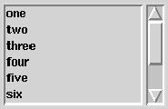
With a plain listbox, some items may be out of view as you saw above. By connecting scrollbars to the listbox, however, the user can scroll the box to look at the items, and the user gets feedback about how many items are in the box and which portion of the items are currently being displayed. Indeed, this is the type of feedback users expect. A scrollbar is added to the example above as follows:
    lbf := frame(f,side='left')
    lb := listbox(lbf)
    sb := scrollbar(lbf)
    whenever sb->scroll do
        lb->view($value)
    whenever lb->yscroll do
        sb->view($value)
    lb->insert("one two three four five six seven eight nine")
In this case, a new frame widget is created , lbf, so the
listbox and the scrollbar are side by side. Figure 11.6 shows
what this looks like.
Two whenever statements are required so that the listbox and the scrollbar update each other. The scrollbar only generates one event, scroll. The value of this event must be relayed to the widget that the scrollbar is controlling, here a listbox. These scroll events are generated by the user moving the scrollbar thumb, i.e. the raised part in the middle of the scrollbar.
The listbox generates two scroll related events, xscroll and yscroll. These allow for both vertical and horizontal scrollbars to be attached to the listbox. The yscroll events are generated either by the user dragging the selection or in response to view events. The xscroll events are generated in response to view events.
This interaction is pretty interesting. The scrollbar generates the scroll event but does not update its appearance. Its apperance is updated by the resulting view event generated by the widget the scrollbar is controlling. Without these whenevers, no scrolling occurs.