
| Version 1.9 Build 1556
|
|


Next: Text
Up: Glish/Tk
Previous: Listbox and Scrollbar
Subsections
This section discusses a few remaining minor widgets which
are useful, but have a single function. These are grouped together in a single
section because they are similar in complexity and functionality.
Label
The label widget does exactly what you would expect; it is used to insert a short
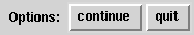
text string into the interface. Here is a simple example:
    f := frame(f,side='left')
    l := label(f,'Options:')
    b1 := button(f,'continue')
    b2 := button(f,'quit')
    whenever b2->press do
        exit
This dialog is shown in Figure 11.7.
Figure 11.7:
Label
 |
The label is simply placed in the frame first, and then the buttons it
describes are added to the frame. Table 11.8 show the other
parameters which can be specified during the creation of a label.
Table 11.8:
Label Construction Parameters
|
Parameter |
Default |
Values |
Description |
| parent |
F |
widget |
parent of the label |
|
text |
'label' |
string |
label text |
|
justify |
'left' |
'center' 'left' 'right' |
justification of text |
|
padx |
4 |
dimension |
horizontal padding |
|
pady |
2 |
dimension |
vertical padding |
|
font |
'' |
X font |
text font |
|
width |
0 |
integer |
width in character units |
|
relief |
'flat' |
'flat' 'ridge' 'raised' 'sunken' 'groove' |
border relief |
|
borderwidth |
2 |
dimension |
border width |
|
foreground |
'black' |
X color |
color of text |
|
background |
'lightgrey' |
X color |
background color |
|
anchor |
'c' |
'c' 'n' 's' 'e' 'w' 'ne' 'nw' 'se' 'sw' |
location of text |
|
fill |
'none' |
'x' 'y' 'both' 'none' |
how to expand when resized |
|
hlcolor |
'' |
X color |
highlight color with focus |
|
hlbackground |
'' |
X color |
highlight color without focus |
|
hlthickness |
[] |
dimension |
hightlight border thickness |
|
Table 11.9 shows the events which labels accept, and as you can
see from the table, labels do not generate events.
Table 11.9:
Label Events
|
Event |
I/O |
Values |
Description |
| anchor |
 |
'c' 'n' 's' 'e' 'w' 'ne' 'nw' 'se' 'sw' |
set location of text |
|
background |
|
X color |
change background color |
|
bind |
|
<X> <G> |
associate Xevent <X> with Glish event <G> |
|
borderwidth |
|
dimension |
change border width |
|
font |
|
X font |
set text font |
|
foreground |
|
X color |
change foreground color |
|
hlbackground |
|
X color |
highlight color without focus |
|
hlcolor |
|
X color |
highlight color with focus |
|
hlthickness |
|
dimension |
hightlight border thickness |
|
justify |
|
'center' 'left' 'right' |
set text justification |
|
padx |
|
dimension |
set horizontal padding |
|
pady |
|
dimension |
set vertical padding |
|
relief |
|
'flat' 'ridge' 'raised' 'sunken' 'groove' |
change border relief |
|
text |
|
string |
set label text |
|
width |
|
integer |
set width (in character units) |
|
Scale
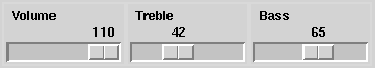
The scale widget allows the user to pick a number out of a range. In other toolkits,
this is called a slider. Here is an example of the creation of a scale:
    f := frame(side='left')
    v := scale(f,0,110,text='Volume')
    t := scale(f,0,110,text='Treble')
    b := scale(f,0,110,text='Bass')
The interface which this example creates is shown in Figure 11.8.
Figure 11.8:
Scale
 |
The value of the slider is posted with the value event. Here is an example,
    whenever v->value do
        print "Volume:",$value
This whenever prints out a message each time the volume is changed. Note
however if you just want to get the last value of the slider, it is accessible as
a member of the agent, in this case v.value. This is because the last
value of each event name is retained in the agent. As a result, whenever
statements are often not needed with scales. Table 11.10 lists the
other construction parameters for scales, and Table 11.11 lists
the scale events.
Table 11.10:
Scale Construction Parameters
|
Parameter |
Default |
Values |
Description |
| parent |
|
widget |
parent of the scale |
|
start |
0.0 |
float |
starting integer for scale |
|
end |
100.0 |
float |
ending integer for scale |
|
value |
start |
float |
initial value for the scale |
|
length |
110 |
integer |
length of scale |
|
text |
'' |
string |
optional label for scale |
|
resolution |
1.0 |
float |
resolution of the scale |
|
orient |
'horizontal' |
'horizontal' 'vertical |
orientation of scale |
|
width |
'15' |
dimension |
width/height of the thumb |
|
font |
'' |
X font |
text font |
|
relief |
'flat' |
'flat' 'ridge' 'raised' 'sunken' 'groove' |
edge relief |
|
borderwidth |
2 |
dimension |
border width |
|
foreground |
'black' |
X color |
color of text |
|
background |
'lightgrey' |
X color |
background color |
|
fill |
'' |
'x' 'y' 'both' 'none' |
how to expand when resized; default: expand with orient |
|
hlcolor |
'' |
X color |
highlight color with focus |
|
hlbackground |
'' |
X color |
highlight color without focus |
|
hlthickness |
[] |
dimension |
hightlight border thickness |
|
showvalue |
T |
boolean |
display the selected value? |
|
Table 11.11:
Scale Events
|
Event |
I/O |
Values |
Description |
| background |
|
X color |
change background color |
|
bind |
|
<X> <G> |
associate Xevent <X> with Glish event <G> |
|
borderwidth |
|
dimension |
change border width |
|
end |
|
integer |
change ending value |
|
font |
|
X font |
set text font |
|
foreground |
|
X color |
change foreground color |
|
hlbackground |
|
X color |
highlight color without focus |
|
hlcolor |
|
X color |
highlight color with focus |
|
hlthickness |
|
dimension |
hightlight border thickness |
|
length |
|
integer |
change length of scale |
|
orient |
|
'horizontal' 'vertical |
change orientation |
|
relief |
|
'flat' 'ridge' 'raised' 'sunken' 'groove' |
change border relief |
|
resolution |
|
float |
change resolution of scale |
|
showvalue |
|
boolean |
show/hide scale value |
|
start |
|
integer |
change starting value |
|
text |
|
string |
set scale label |
|
value |
 |
integer |
value changed by user |
|
width |
|
integer |
change width/height of scale |
|
Message
The message widget is viewed as a multi-line label. It is essentially a
scratch pad for displaying several word messages to the user. For long messages,
the text widget is a better choice.
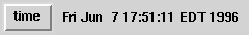
Here is an example of the message widget in use:
    f := frame(side='left')
    b := button(f,'time')
    m := message(f,shell('date'))
    whenever b->press do
        m->text(shell('date'))
This simple example updates the time display in the message widget whenever
the button is pressed. This looks like Figure 11.9.
Figure 11.9:
Message
 |
In general, the text event is the primary event for the message widget.
The other construction parameters are shown on Table 11.12.
The message widget itself does not generate any event, but the events which
it accepts are shown in Table 11.13.
Table 11.12:
Message Construction Parameters
|
Parameter |
Default |
Values |
Description |
| parent |
|
widget |
parent of the message |
|
text |
'message' |
string |
text for message |
|
width |
180 |
dimension |
width of message |
|
justify |
'center' |
'center' 'left' 'right' |
justification of text |
|
font |
'' |
X font |
font of text |
|
padx |
7 |
dimension |
horizontal padding |
|
pady |
3 |
dimension |
vertical padding |
|
relief |
'raised' |
'flat' 'ridge' 'raised' 'sunken' 'groove' |
edge relief |
|
borderwidth |
2 |
dimension |
border width |
|
foreground |
'black' |
X color |
color of text |
|
background |
'lightgrey' |
X color |
background color |
|
anchor |
'c' |
'c' 'n' 's' 'e' 'w' 'ne' 'nw' 'se' 'sw' |
location of text |
|
fill |
'none' |
'x' 'y' 'both' 'none' |
how to expand when resized |
|
hlcolor |
'' |
X color |
highlight color with focus |
|
hlbackground |
'' |
X color |
highlight color without focus |
|
hlthickness |
[] |
dimension |
hightlight border thickness |
|
Table 11.13:
Message Events
|
Event |
I/O |
Values |
Description |
| anchor |
|
'c' 'n' 's' 'e' 'w' 'ne' 'nw' 'se' 'sw' |
set location of text |
|
background |
|
X color |
change background color |
|
bind |
|
<X> <G> |
associate Xevent <X> with Glish event <G> |
|
borderwidth |
|
dimension |
change border width |
|
font |
|
X font |
set font for text |
|
foreground |
|
X color |
change foreground color |
|
hlbackground |
|
X color |
highlight color without focus |
|
hlcolor |
|
X color |
highlight color with focus |
|
hlthickness |
|
dimension |
hightlight border thickness |
|
justify |
|
'center' 'left' 'right' |
set justification for text |
|
padx |
|
dimension |
set horizontal padding around text |
|
pady |
|
dimension |
set vertical padding around text |
|
relief |
|
'flat' 'ridge' 'raised' 'sunken' 'groove' |
change border relief |
|
text |
|
string |
set text |
|
width |
|
integer |
set width (in character units) |
|
Entry
The entry provides slots where the user can type in text. The script
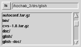
can then retrieve this text when it is needed. Here is a more complex example:
    f := frame()
    ef := frame(f,side='left')
    b := button(ef,'ls')
    en := entry(ef)
    lbf := frame(f,side='left')             # **
    lb := listbox(lbf,width=32)             # **
    sb := scrollbar(lbf)                    # **
    whenever b->press, en->return do
        {
        lb->delete("start","end")
        dir := en->get()
        files := shell('if [ -r',dir,'];then ls -1F',dir,';else exit 1;fi')
        if ( ! files::status )
            lb->insert(files)
        else
            en->insert('*BAD DIRECTORY* ','start')
        }
    whenever sb->scroll do                  # **
        lb->view($value)                    # **
    whenever lb->yscroll do                 # **
        sb->view($value)                    # **
In this example, first note that the lines tagged with ** are nearly
identical to the listbox plus scrollbar example in
§ 11.4.2. The remaining lines setup a button and an entry
widget. Next the listbox plus scrollbar dialog from the
previous example is used. In this dialog, the user enters a directory in the
entry widget, and the contents of the directory shows up in the
listbox (see Figure 11.10).
The mechanics of this are controlled by the first
whenever. Whenever the user presses the button or hits the
<return> key in the entry widget, the listbox is cleared, the string
from the entry widget is retrieved, an ls is done on the directory, and if it
succeeds, the output is used to fill the listbox otherwise an error is
indicated in the entry widget. The complicated shell() command which
actually does the ls just checks to see if the directory exists, and if
it does exist, the ls is done, otherwise the shell command exits with a
non-zero status.
Figure 11.10:
Entry
 |
This example shows three of the entry widget events, get,
insert, and return. The get event returns
the contents of the entry widget and the insert event inserts text
into the entry widget.
The second parameter to insert is optional, and it specifies where to
insert the string. By default, the string is inserted at the end. The return
event is generated when the user hits the <return> key in the entry
widget. Table 11.14 list all of the parameters to entry(), and
Table 11.15 lists the entry widget events.
Table 11.14:
Entry Construction Parameters
|
Parameter |
Default |
Values |
Description |
| parent |
|
widget |
parent of the entry |
|
width |
0 |
integer |
width in character units |
|
justify |
'center' |
'center' 'left' 'right' |
justification of text |
|
font |
'' |
X font |
font of text |
|
relief |
'raised' |
'flat' 'ridge' 'raised' 'sunken' 'groove' |
edge relief |
|
borderwidth |
2 |
dimension |
border width |
|
foreground |
'black' |
X color |
color of text |
|
background |
'lightgrey' |
X color |
background color |
|
disabled |
F |
boolean |
is inactivated? |
|
show |
T |
boolean |
show typed characters? |
|
exportselection |
F |
boolean |
export to X clipboard? |
|
fill |
'x |
'x' 'y' 'both' 'none' |
how to expand when resized |
|
hlcolor |
'' |
X color |
highlight color with focus |
|
hlbackground |
'' |
X color |
highlight color without focus |
|
hlthickness |
[] |
dimension |
hightlight border thickness |
|
Table 11.15:
Entry Events
|
Event |
I/O |
Values |
Description |
| background |
|
X color |
change background color |
|
bind |
|
<X> <G> |
associate Xevent <X> with Glish event <G> |
|
borderwidth |
|
dimension |
change border width |
|
delete |
|
string |
delete indicated character, use 2 strings to delete range |
|
disable |
|
|
disable widget, must be balanced by enable |
|
disabled |
|
boolean |
set state, disable ( T) or enable ( F) |
|
enable |
|
|
enable widget, must be balanced by disable |
|
exportselection |
|
boolean |
export selection to X clipboard? |
|
font |
|
X font |
change text font |
|
foreground |
|
X color |
change foreground color |
|
get |
 |
|
get current contents |
|
hlbackground |
|
X color |
highlight color without focus |
|
hlcolor |
|
X color |
highlight color with focus |
|
hlthickness |
|
dimension |
hightlight border thickness |
|
insert |
|
string |
insert item, optional 2nd param insert index |
|
justify |
|
'center' 'left' 'right' |
set justification for text |
|
relief |
|
'flat' 'ridge' 'raised' 'sunken' 'groove' |
change border relief |
|
return |
|
string |
generated when user hits return, returns contents |
|
show |
|
boolean |
show typed characters? |
|
view |
|
record |
scrollbar update event |
|
width |
|
integer |
entry width in character units |
|
xscroll |
|
double |
information for horizontal scrollbar update |
|
Notice in Table 11.15 that the entry widget generates
the events necessary to connect a horizontal scrollbar to the entry widget.
This is done in a way analogous to connecting a vertical scrollbar to the
listbox, i.e. change yscroll to xscroll.
Next: Text
Up: Glish/Tk
Previous: Listbox and Scrollbar
Contents
Index
Please send questions or comments about AIPS++ to aips2-request@nrao.edu.
Copyright © 1995-2000 Associated Universities Inc.,
Washington, D.C.
Return to AIPS++ Home Page
2006-10-15
 News
News